1.1 What Can We Learn From Data?
I'm not going to beat around the bush — you're taking (or interested in taking AP Statistics). You probably know that data are important. There are plenty of decisions you can make better with data, and you can be much more critical of decisions being made around you if you understand how data works. I'll use data as plural and singular interchangeably, it really doesn't matter.
In our world, everything varies. That's why we need data.
Given that variations may be random or not, conclusions are never certain. Still, we want to make conclusions — so how do we do that? We start with collecting data. In most AP Statistics classes, the first semester focuses almost exclusively on collecting, presenting, and analyzing data. Drawing conclusions is typically left for the second semester.
So what can we learn from data? Everything.
1.2 The Language of Variation: Variables
Variable
Variables are the foundation of statistics. A variable is a characteristic that changes from one individual to another. There are two types of variables: categorical and quantitative.
- Categorical.
A categorical variable takes on values that are category names or group labels. Ex. dominant hand (left or right), highest degree earned (high school diploma, PhD, etc.), ZIP code, age group (infant, toddler, tween, teenager, adult). These are things that describe an individual and put them in a category. Most of the time, categorical variables will be words, but keep in mind that they can sometimes be numbers (like ZIP code). On the AP test, it's unlikely CollegeBoard will try to trick you with this. - Quantitative.
A quantitative variables takes on numerical values for a measured or counted quantity. Ex. age of a structure, height, salt concentration, number of Skittles in a pack. This explains the ZIP code example — you don't "measure" someone's ZIP code, and you don't "count" someone's ZIP code either. Similarly, a student ID (or Social Security number) is a categorical variable — you don't "measure" an ID, and you don't "count" an ID. Another good check for quantitative-ness is whether or not there's a unit after it: number of desks in a classroom ("22 desks") is a quantitative variable, while student ID ("420123") is a categorical variable. One last test: quantitative variables need to be averaged. You can say "the average number of Skittles is 42," but you can't say "the average high school grade level (9-12) is 10.32!" Make sure you understand this last example, and you should be good!
Individual
An individual is anything that we can collect data from: people, objects, animals, places, and so on.
1.3 Representing a Categorical Variable With Tables
Frequency Table
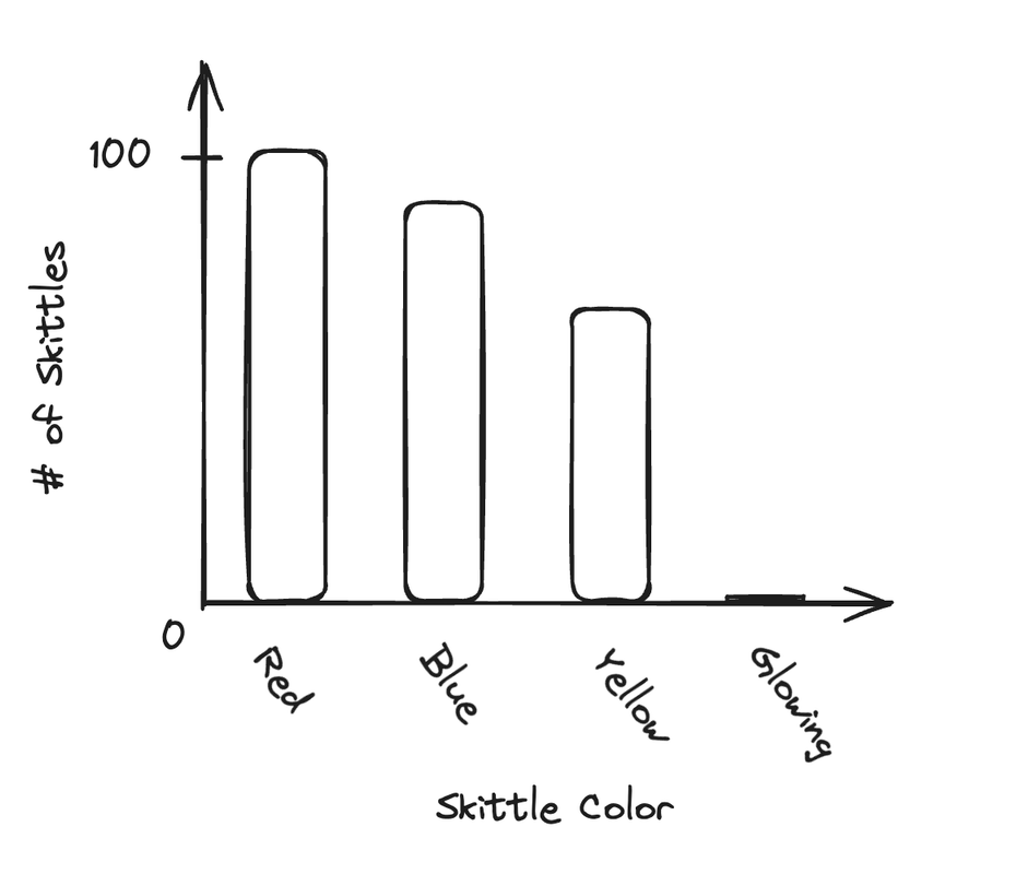
We love representing data. The simplest way is a frequency table. It's just... a table. Of frequencies. A frequency table gives the number of cases falling into each category. Here's an example:
| Skittle Color | Number of Skittles |
|---|---|
| Red | 100 |
| Blue | 93 |
| Yellow | 82 |
| Glowing (and radioactive) | 0 |
| Total | 275 |
Note. Not based on real data.
Relative Frequency Table
The number of skittles of each type doesn't really tell us much. We can use a relative frequency table to present more helpful data. A relative frequency table gives the proportion of cases falling into each category.
| Skittle Color | Relative Frequency | Percent |
|---|---|---|
| Red | 0.36364 | 36.364% |
| Blue | 0.33818 | 33.818% |
| Yellow | 0.29818 | 29.818% |
| Glowing (and radioactive) | 0 | 0% |
| Total | 1 | 100% |
Note. Not based on real data.
Calculating this is easy — just divide each frequency by the total frequency. This table gives us something useful! Now, instead of "there are 100 red Skittles," we can say "33% of the Skittles are red" — and now we understand the relative distribution. "There are 100 red Skittles" doesn't tell us anything — is that a lot? Is it basically nothing?
1.4 Representing a Categorical Variable With Graphs
Bar Charts
Bar charts can be used to display frequencies or relative frequencies of a categorical variable only. It's really easy to make a bar chart. From the Skittle example in the last section, we'd get this bar chart:
Really, the only things you need is the following:
- LABELLED AXES (people forget),
- Proper scale — your data should take up the entirety of the graph,
- Spaces between bars — it's a bar chart, not a histogram (which we'll get to soon),
- Equal-width bars, and
- Start at zero.
Pie Charts
Pie charts are similar to bar graphs, but, like relative frequency bar charts, they lose the actual counts. It's difficult to mess one up:
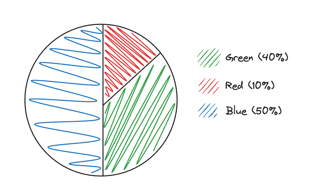
Make sure to always include a key (if not labeled) and exact values. Here's an example that labels (and, as such, doesn't need a key):
I tend to use both a label and a key, but it's mostly up to you.
1.5 Representing a Quantitative Variable With Graphs
There are quite a few ways to represent a quantitative variable with graphs. It's important to choose correctly. There are two types of quantitative variables: discrete and continuous.
Discrete Quantitative Variables
Discrete QVs can take on a countable number of values (keep in mind that this could be a "countable infinity" number of values). For example, if a variable can take on any whole number value, it has a countable infinity number of values. Ex. number of games a team wins (which could have no upper bound, in theory), number of fingers, geyser eruptions per day, etc.
Continuous Random QVs
Continuous variables are, well, continuous: for any two values, it's always possible to find one in between them. Ex. height, concentration of salt. These are typically values that can't be counted, but are instead measured.
Now, on to the graphing. For all of these graphs, you'll need to have an x-axis that covers all of your data — it's up to you what scale to use and where to start the axis. All of these graphs represent the distribution of the data, or what values the data took on and how often it took on those values.
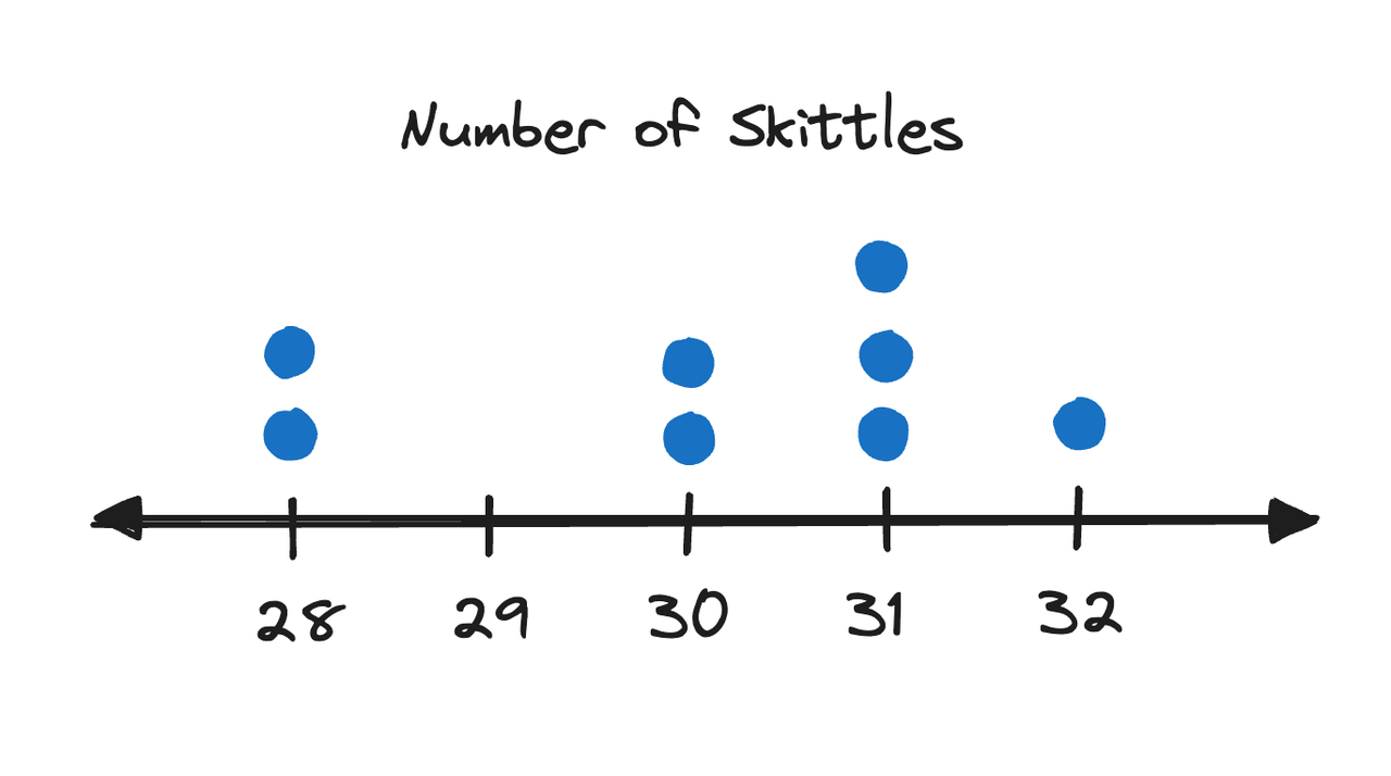
1. Dot Plots
Dot plots are best used for discrete QVs. This is just a number line with dots representing occurrence of each value. For example, if we counted the number of Skittles in some packs of Skittles, we might get a dot plot like this (the numbers are entirely made up):